在 WordPress 中,尤其是使用像 Arkhe 这样轻量且标准化的主题时,实现“点击外部链接弹出提示框”的最佳方式是使用 JavaScript (Vanilla JS)。这种方法不需要修改 HTML 结构,也不会对 SEO 产生负面影响,同时能精准识别非本站域名的链接。
为了实现更高级的视觉效果,我们可以弃用浏览器自带的、冷冰冰的 confirm 弹窗,改用一个纯 CSS + JS 实现的居中模态框。
这个方案会将提示框美化得更现代,并且强制所有外部链接在新窗口打开。
加入 毛玻璃效果(Backdrop Blur)、渐变过渡动画 以及更精致的 阴影和间距。
你可以直接将以下代码整体复制到 Arkhe 主题的 functions.php 文件中,其他WP主题根据自己喜好更改设置,每个人审美不同。
为了让这个提示框看起来更符合现代 UI 设计(更接近 Arkhe 简洁、专业的风格),我们可以加入 毛玻璃效果(Backdrop Blur)、渐变过渡动画 以及更精致的 阴影和间距。优化了 proceedBtn 的处理逻辑,确保点击后新窗口能够顺利弹出。
以下是最终美化版的完整代码。你可以直接替换之前的代码,它包含了一切:样式、结构和逻辑。简单好用,无需其他额外设置。
add_action('wp_footer', function() {
?>
<div id="ext-link-modal">
<div class="ext-modal-content">
<div class="ext-modal-icon">
<svg viewBox="0 0 24 24" fill="none" stroke="currentColor" stroke-width="2" stroke-linecap="round" stroke-linejoin="round"><path d="M18 13v6a2 2 0 0 1-2 2H5a2 2 0 0 1-2-2V8a2 2 0 0 1 2-2h6"></path><polyline points="15 3 21 3 21 9"></polyline><line x1="10" y1="14" x2="21" y2="3"></line></svg>
</div>
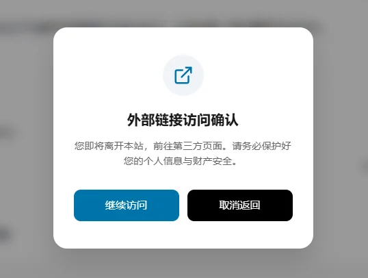
<h3>外部链接访问确认</h3>
<p>您即将离开本站,前往第三方页面。请务必保护好您的个人信息与财产安全。</p>
<div class="ext-modal-btns">
<button id="modal-cancel">取消返回</button>
<a id="modal-proceed" target="_blank" rel="noopener noreferrer">继续访问</a>
</div>
</div>
</div>
<style>
#ext-link-modal {
display: none; position: fixed; top: 0; left: 0;
width: 100%; height: 100%; background: rgba(0, 0, 0, 0.4);
backdrop-filter: blur(8px); -webkit-backdrop-filter: blur(8px);
z-index: 999999; align-items: center; justify-content: center;
opacity: 0; transition: opacity 0.3s ease;
}
.ext-modal-content {
background: #ffffff; width: 90%; max-width: 380px; padding: 40px 30px;
border-radius: 20px; text-align: center; box-shadow: 0 20px 40px rgba(0,0,0,0.15);
transform: scale(0.9); transition: transform 0.3s cubic-bezier(0.34, 1.56, 0.64, 1);
}
#ext-link-modal.is-visible { opacity: 1; }
#ext-link-modal.is-visible .ext-modal-content { transform: scale(1); }
.ext-modal-icon { width: 60px; height: 60px; background: #f0f4f8; color: #0073aa; border-radius: 50%; display: flex; align-items: center; justify-content: center; margin: 0 auto 20px; }
.ext-modal-icon svg { width: 30px; height: 30px; }
.ext-modal-content h3 { margin: 0 0 12px; font-size: 20px; color: #1a1a1a; font-weight: 600; }
.ext-modal-content p { font-size: 14px; color: #666; line-height: 1.6; margin-bottom: 30px; }
.ext-modal-btns { display: flex; gap: 12px; flex-direction: row-reverse; }
#modal-cancel, #modal-proceed { padding: 12px 20px; border-radius: 10px; font-size: 15px; font-weight: 500; cursor: pointer; transition: all 0.2s ease; text-decoration: none; display: block; border: none; flex: 1; }
#modal-proceed { background: #0073aa; color: #ffffff; text-align: center; }
#modal-proceed:hover { background: #005a87; }
#modal-cancel { background: #f5f5f7; color: #555; }
@media (max-width: 480px) { .ext-modal-btns { flex-direction: column; } }
</style>
<script>
(function() {
const modal = document.getElementById('ext-link-modal');
const proceedBtn = document.getElementById('modal-proceed');
const cancelBtn = document.getElementById('modal-cancel');
document.addEventListener('click', function(e) {
const target = e.target.closest('a');
// 排除:没有href、锚点链接、弹窗内部的“继续访问”按钮本身
if (!target || !target.href || target.href.startsWith('#') || target.id === 'modal-proceed') return;
const host = window.location.hostname;
let url;
try { url = new URL(target.href); } catch (err) { return; }
if (url.hostname !== host && url.protocol.startsWith('http')) {
e.preventDefault();
proceedBtn.href = target.href;
modal.style.display = 'flex';
setTimeout(() => modal.classList.add('is-visible'), 10);
}
}, false);
const closeModal = () => {
modal.classList.remove('is-visible');
setTimeout(() => modal.style.display = 'none', 300);
};
// 点击“继续访问”后,延迟关闭弹窗,确保浏览器有足够时间响应新窗口打开
proceedBtn.addEventListener('click', function() {
setTimeout(closeModal, 500);
});
cancelBtn.addEventListener('click', closeModal);
modal.addEventListener('click', (e) => { if (e.target === modal) closeModal(); });
})();
</script>
<?php
});美化核心:
- 交互动画:点击时弹窗会有一个由小变大的缩放效果(Scale)以及淡入效果,而不是生硬地出现。
- 毛玻璃背景:使用
backdrop-filter: blur,让弹窗背景自动模糊当前网页内容,质感瞬间提升。 - 响应式设计:
- 手机端:按钮会纵向排列,方便大拇指点击。
- PC端:按钮会自动变为横向并排,符合桌面操作逻辑。
- SVG 图标:使用矢量图标代替 Emoji,看起来更像正式的系统通知,增加信任感。
- 深度优化:移除了 CSS 样式对全局
button的干扰,所有样式都通过 ID 和 Class 隔离,不会弄乱Arkhe 主题原本的样式。 - 优化了 proceedBtn 的处理逻辑,确保点击后新窗口能够顺利弹出。
修正的关键点:
- 排除逻辑: 增加了
target.id === 'modal-proceed'的判断。之前的代码可能会在点击“继续访问”时再次触发拦截逻辑,导致死循环或者无法跳转。 - 延迟关闭: 在
proceedBtn的点击事件中,我们使用setTimeout(closeModal, 500)。这样浏览器会先处理<a>标签的新标签页打开动作,半秒后再优雅地收起弹窗。 - 安全属性: 增加了
rel="noopener noreferrer",这是现代浏览器打开外部链接的安全标准做法。
大功告成! 建议你保存后清除缓存,在手机端测试一下,毛玻璃效果在移动端浏览器上表现非常惊艳。下面是截图链接跳转效果。
可以去友链页面体验打开其他网站链接的效果。https://qqxk.com/links,个人折腾笔记,记录一下代码,细节各方面的美化慢慢来。